The world of Search Engine Optimization (SEO) is constantly evolving, and perhaps no force is reshaping it more profoundly than Artificial Intelligence (AI). From Google’s AI Overviews to the integration of generative AI in content creation, the rules of the game are shifting. At The Web Ally, we’re dedicated to staying at the forefront of these changes to ensure our clients not only survive but thrive.
We consistently follow insights from many leading SEO experts who emphasize that AI isn’t killing SEO; it’s simply killing bad SEO. For agencies like ours, and for businesses serious about their online presence, this means refining our strategies to align with how AI processes and presents information.
Here are some of the key takeaways and immediate shifts we’re making (and recommending to our clients) based on expert advice on AI-driven SEO:
1. Shift from Keywords to Topical Authority & Clusters
Gone are the days of hyper-focusing on single keywords in isolation. AI models are designed to understand complex topics and relationships between pieces of content. Experts advocate for a strong shift towards topical authority and content clusters.
- What it means for you: Instead of just writing an article for “best vegan pasta,” you should aim to cover the entire topic of “vegan pasta recipes” comprehensively. This involves creating a central “pillar page” and then numerous supporting articles that delve into specific aspects (e.g., “quick vegan pasta dishes,” “vegan pasta for meal prep,” “gluten-free vegan pasta options”).
- Why it matters: AI rewards sites that become the definitive resource on a subject. By demonstrating deep knowledge across a topic, you signal to AI systems that your content is authoritative and trustworthy.
2. Embrace Answer Engine Optimization (AEO)
With the rise of AI Overviews and conversational search, users aren’t just typing keywords; they’re asking questions. AI is designed to understand these questions and provide direct answers.
- What it means for you: Your content needs to be structured in a way that directly answers potential questions AI might ask itself during query processing. Think about the “People Also Ask” sections in Google – these are goldmines for identifying conversational queries.
- Why it matters: Optimizing for AEO means structuring your content with clear, concise headers (H2s, H3s), providing detailed explanations, and including supporting evidence that AI can easily parse and cite. This increases your chances of appearing in AI-generated summaries.
3. Develop Multi-Step Reasoning Content
AI Overviews often involve “query fan-out techniques,” where one user question triggers numerous parallel searches to gather comprehensive information.
- What it means for you: Anticipate follow-up questions within your content. If you’re answering “How to make a website,” consider addressing common subsequent queries like “What platform should I use?” or “How much does it cost?” within the same article.
- Why it matters: By providing answers to a user’s entire potential information journey within a single piece of content, you reduce the need for AI to search elsewhere, making your content more valuable and citable.
4. Prioritize Authority-Building Backlinks & EEAT
Many leading SEO experts consistently stress that EEAT (Experience, Expertise, Authoritativeness, Trustworthiness) signals are more critical than ever for AI citations. And a strong link profile remains a cornerstone of EEAT.
- What it means for you: Focus on acquiring high-quality, niche-relevant backlinks from authoritative sites. These aren’t just about passing “link juice” anymore; they’re about signaling to Google’s AI systems that your website is a trusted and expert source.
- Why it matters: AI relies on trusted sources. If your content is backed by links from reputable sites, it significantly boosts its credibility in the eyes of AI and increases its likelihood of being cited in AI Overviews.
5. Focus on User-Centric SEO & Scannability
While AI is processing information, the ultimate goal is to serve human users. Google continues to prioritize user experience signals.
- What it means for you: Your content should be easy to read and digest. Use short paragraphs, clear headings, bullet points, and visuals. Ensure a good “last-click satisfaction” – meaning users find what they need on your page and don’t immediately bounce back to the SERP.
- Why it matters: AI might summarize your content, but a good user experience ensures that when a user clicks through to your site, they engage with your content, which signals quality to Google.
The Web Ally’s Approach to AI-Powered SEO
At The Web Ally, we see AI not as a threat, but as a powerful tool and a new frontier for SEO. By understanding and implementing these AI-driven tactics, we can help our clients:
- Gain AI citations and visibility: Appearing in AI Overviews can dramatically increase brand visibility and drive qualified traffic.
- Build stronger topical authority: Establishing your website as the go-to resource in your niche.
- Improve overall search performance: AI-optimized content often performs better in traditional search results too.
- Future-proof their SEO strategy: Adapting to AI now ensures long-term success in a rapidly changing digital landscape.
The integration of AI into search is a continuous journey. By adopting these “AI Top Tactics,” we empower our clients to not just adapt, but to lead.
Call to Action:
Ready to optimize your website for the AI era? Contact The Web Ally today for a consultation on how our AI-powered SEO strategies can boost your online presence and drive tangible results.
Welcome to the exciting world of SEO! Whether you’re a newbie or a seasoned digital explorer, understanding the basics of SEO is key to unlocking success online.
In this blog post, we’ll break down the fundamentals of SEO in simple terms, empowering you to elevate your website’s visibility and attract more visitors.
What is SEO?
At its core, SEO is all about improving your website’s visibility on search engines like Google. When someone searches for a topic related to your website, you want to ensure that your site appears at the top of the search results.
SEO helps you achieve this by optimizing your website’s content and structure to make it more attractive to search engines.
Keywords and Content Optimization:
Keywords are the foundation of SEO.
These are the words and phrases that people type into search engines when looking for information. By conducting keyword research, you can identify the terms your target audience is searching for and incorporate them into your website’s content.
From blog posts to product descriptions, optimizing your content with relevant keywords can help boost your search engine rankings and attract more organic traffic.
On-Page Optimization:
On-page optimization involves optimizing individual pages of your website to improve their search engine rankings. This includes optimizing meta tags (title tags and meta descriptions), using heading tags (H1, H2, H3, etc.) to structure your content, and ensuring your URLs are descriptive and user-friendly.
By following on-page optimization best practices, you can make it easier for search engines to understand and index your content, ultimately improving your website’s visibility in search results.
Technical SEO Essentials:
Technical SEO focuses on the backend aspects of website optimization that affect its search engine visibility. This includes factors like site speed, mobile-friendliness, and site architecture.
By ensuring your website is fast, responsive, and well-structured, you can provide a better user experience and improve your chances of ranking higher in search results.
Link Building and Off-Page SEO:
Off-page SEO involves activities that take place outside of your website but can still impact your search engine rankings. One of the most important off-page SEO strategies is link building, which involves acquiring backlinks from other websites.
Backlinks act as votes of confidence for your website, signaling to search engines that your content is valuable and trustworthy.
By earning high-quality backlinks from reputable websites, you can improve your website’s authority and credibility, ultimately boosting its search engine rankings.
Conclusion:
Congratulations! You’ve now got a solid understanding of the basics of SEO. By implementing the strategies outlined in this guide, you can start optimizing your website for better search engine visibility and attracting more organic traffic.
Remember, SEO is an ongoing process, so keep experimenting, learning, and adapting to stay ahead of the curve in the ever-changing world of digital marketing.
If you need help in implementing SEO Strategies to your website for better search results, The Web Ally is here to help.
In the ever-evolving landscape of digital presence, the significance of website page speed has surged to unprecedented heights as we venture into 2024. This seemingly minute factor exerts a profound influence on various facets of online performance, extending its reach from search engine rankings to user engagement metrics and conversion rates.
In this comprehensive guide, we embark on a journey to unravel the intricate nuances surrounding page speed, delving deep into its essence, importance, optimal benchmarks, troubleshooting methods, and optimization strategies.
Understanding Page Speed
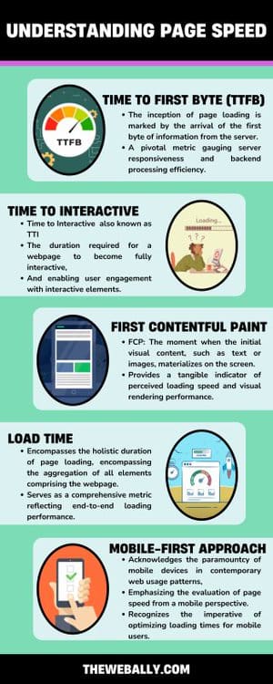
At its core, page speed encapsulates the temporal dimension of user experience, delineating the time taken for a webpage to fully load.
However, this seemingly straightforward metric embodies a multifaceted realm, encompassing diverse elements that collectively define the user’s interaction with the website. To elucidate the intricate tapestry of page speed, let us dissect its various constituents:
Time to First Byte (TTFB)
The inception of page loading, marked by the arrival of the first byte of information from the server.
A pivotal metric gauging server responsiveness and backend processing efficiency.
Time to Interactive (TTI)
The duration required for a webpage to become fully interactive, enabling user engagement with interactive elements.
Offers insights into potential bottlenecks arising from JavaScript execution and client-side rendering.
First Contentful Paint (FCP)
The moment when the initial visual content, such as text or images, materializes on the screen.
Provides a tangible indicator of perceived loading speed and visual rendering performance.
Load Time
Encompasses the holistic duration of page loading, encompassing the aggregation of all elements comprising the webpage.
Serves as a comprehensive metric reflecting end-to-end loading performance.
Mobile-First Approach
Importance of Page Speed for SEO
Page speed emerges as a linchpin in the intricate machinery of Search Engine Optimization (SEO), wielding a pervasive impact on search engine rankings, user experience, and conversion rates alike. Here’s a succinct elucidation of the symbiotic relationship between page speed and SEO:
Site Speed and SEO
Page loading velocity assumes pivotal significance in search engine algorithms, underscoring Google’s aversion towards sluggish websites that impede user satisfaction.
Accelerating page speed augments crawlability, indexing efficiency, and overall search engine visibility, thereby enhancing organic search performance.
Page Loading Speed and UX
The linchpin of user-centric design, page speed exerts a profound influence on user experience, with prolonged loading times engendering user frustration and abandonment.
Swift-loading websites foster a seamless browsing experience, curbing bounce rates and augmenting engagement metrics, which in turn, catalyze SEO performance.
Website Speed and Conversion Rate Optimization (CRO)
Page speed stands as a cornerstone of Conversion Rate Optimization (CRO), wielding a palpable influence on user retention, conversion funnel progression, and transactional outcomes.
Streamlining page loading facilitates frictionless user journeys, mitigating user attrition and amplifying conversion rates, thereby fortifying the website’s revenue-generating potential.
Ideal Page Speed for SEO
The pursuit of an optimal page speed threshold remains a perennial quest, with benchmarks contingent on diverse variables such as page type, user expectations, and industry norms.
While conventional wisdom extols the virtues of a sub-2 second loading time, pragmatic considerations necessitate a nuanced evaluation of page speed metrics tailored to specific contexts.
Average Page Load Speed
Factors Influencing Website Speed
Embracing Best Practices
Embark on a journey towards page speed optimization, embracing an arsenal of best practices and strategic interventions to bolster loading efficiency.
Emphasize the deployment of a robust hosting infrastructure, leverage caching mechanisms, streamline codebase through minification, and optimize asset delivery via Content Delivery Networks (CDNs).
Conclusion
In 2023, the digital world changed a lot. Now, how fast your website loads is super important for success online.
As businesses try to keep up with all these changes, making sure your website loads quickly is like having a secret weapon for being better than your competition and getting more people to visit your site through search engines.
To do this, companies need to focus on making their websites easy to use and super fast. This means using smart designs and new technology to make sure people can get around your website quickly, without having to wait too long for pages to load.
This helps protect your website from being slow or outdated in the fast-moving world of the internet. If you want a website for your business that is optimally maintained in terms of page speed and SEO, contact The Web Ally today!
🚨 Important Notice: Beware of Scammers Impersonating Our Company 🚨
To whom it may concern,
It has come to our attention that scammers are currently impersonating our company, using our name and logo to deceive people on Wise (formerly TransferWise). We want to assure you that The Web Ally has no association with these fraudulent activities whatsoever.
If you receive any requests for money or financial transactions claiming to be from The Web Ally on Wise or other platforms, please be vigilant and do not engage. These are scams orchestrated by malicious actors.
We urge anyone who has fallen victim to this scam to immediately open a claim with Wise to seek a refund. Additionally, please note that we have reported this matter to the Malta Police Cyber Crime unit, and they are actively investigating the situation.
Your trust and security are our top priorities, and we are committed to taking all necessary steps to protect our community from such fraudulent activities.
Thank you for your cooperation and understanding.
Regarding WooCommerce stores, speed matters because a faster page load converts better in terms of sales and revenue. While your WooCommerce theme isn’t the only factor affecting load times, it plays a significant role.
After conducting hands-on testing, we’ve identified some of the fastest WooCommerce themes that also offer great design and functionality:
- Botiga: This dedicated WooCommerce theme has modular features to enhance user shopping experiences and increase conversions.
- Blocksy: A versatile theme with strong WooCommerce support and multiple eCommerce starter sites.
- Sydney: A multipurpose business theme tightly integrated with WooCommerce.
- Woostify: Another dedicated WooCommerce theme offering various importable starter sites.
- GeneratePress: A multipurpose theme with specific functionality tailored for WooCommerce.
- Neve: Yet another multipurpose theme with extensive WooCommerce features, particularly in the Pro version, which includes a WooCommerce Booster module.
However, these are just some of the high-performing WooCommerce themes available. Our complete list includes other excellent options as well.
We recommend reading the full post for more details on our findings and performance tests for each theme. There, we provide data from our hands-on tests and offer basic information about each theme to help you make an informed decision.
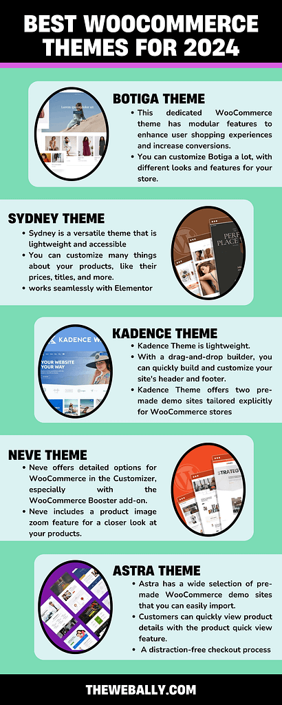
1. Sydney
Sydney is a versatile theme that is lightweight and accessible for all kinds of websites, especially online stores, using WooCommerce.
One of the few WooCommerce themes that are constantly being innovated, Sydney is getting faster, and so, it’s among the quickest themes for WooCommerce.
Sydney is built without relying on jQuery, which helps it load faster and run smoothly. Plus, it is coded following the best methods to ensure your store loads quickly. But speed isn’t the only thing Sydney offers. It’s fully compatible with WooCommerce and has many features to help your store succeed. There are numerous example sites for WooCommerce stores to use as a starting point.
Sydney also works well with the Merchant plugin, which gives you access to over 40 extra tools to enhance your WooCommerce store.
Here are some key features of Sydney:
- Numerous example websites specifically for WooCommerce, but other demos are also available.
- You can customize many things about your products, like their prices, titles, and more.
- It includes a handy mini cart that slides in when you add something to your cart.
- The checkout process is designed to be simple and distraction-free.
- You can add video headers to your site for a dynamic touch.
- Sydney works seamlessly with Elementor, a famous page builder, and includes custom blocks.
- As we mentioned before, it doesn’t rely on jQuery and includes built-in schema markup to help with SEO.
2. Kadence Theme
Kadence Theme is a versatile option for your website, especially if you’re running an online store with WooCommerce.
Owned by StellarWP, a significant player in the WordPress world, Kadence Theme comes with deep integration with WooCommerce. StellarWP is known for products like SolidWP (iThemes), LearnDash, The Events Calendar, GiveWP, and Restrict Content Pro.
With Kadence Theme, you get access to various starter sites that you can import to kickstart your project. Plus, it offers extensive customization options within the WordPress Customizer, making it easy to tweak your site.
For WooCommerce users, Kadence Theme works seamlessly with the Kadence Shop Kit plugin, which adds extra features to enhance your online store.
Here are some standout features of the Kadence Theme:
- Extensive customization options are available directly in the WordPress Customizer.
- You can quickly build and customize your site’s header and footer with a drag-and-drop builder.
- The side cart automatically opens when a user adds a product to their cart, providing a seamless shopping experience.
- Ajax add-to-cart functionality allows for smooth and quick product additions.
- You can effortlessly add microcopy and trust badges at strategic points on your site to boost customer confidence.
- Kadence Theme offers two pre-made demo sites tailored explicitly for WooCommerce stores, making it easy to get started with your online shop.
3. Neve
Neve is a versatile theme created by ThemeIsle, known for its lightweight design.
The free version of Neve provides a solid base and works well with WooCommerce. If you opt for the premium version, you’ll get even more WooCommerce-specific features through its WooCommerce Booster module.
Here are some key features of Neve:
- You can easily customize your site’s header and footer using a drag-and-drop builder.
- Neve offers detailed options for WooCommerce in the Customizer, especially with the WooCommerce Booster add-on.
- With a checkbox, you can toggle product metadata on and off.
- Neve includes a product image zoom feature for a closer look at your products.
- The checkout page is designed to minimize distractions, and you can hide specific fields, like the coupon field, if you don’t use coupons.
- Customers can quickly view product details with the product quick view feature.
- Neve also includes a wishlist feature, allowing customers to save items for later.
- Overall, Neve prioritizes performance, ensuring your website loads quickly and runs smoothly.
4. Astra
Astra is incredibly popular, boasting over one million active installs on WordPress.org, making it one of the most widely used themes.
It’s a versatile theme suitable for any website. If you opt for the premium version, you’ll find deep integration with WooCommerce and a plethora of handy features.
Astra has a diverse range of over 250 starter sites, including many designed specifically for WooCommerce stores. This extensive library offers plenty of choices when setting up your online shop.
Here are some standout features of Astra:
- A wide selection of pre-made WooCommerce demo sites that you can easily import.
- Extensive style and layout customization options available in the WordPress Customizer.
- An off-canvas sidebar that provides convenient access to product filters and widgets.
- Customers can quickly view product details with the product quick view feature.
- Infinite scroll functionality for seamless browsing through products.
- A drop-down cart for easy access to the shopping cart.
- Various options for customizing product galleries to showcase your products effectively.
- A distraction-free checkout process to streamline the purchasing experience.
- Product catalogue sorting options, such as sorting by popularity or average rating, to help customers find what they’re looking for quickly.
5. Woostify
Woostify is a specialized WordPress theme exclusively tailored for WooCommerce stores. Think of it as the Astra of WooCommerce themes, focusing solely on enhancing the WooCommerce experience.
Here are some key features that set Woostify apart:
- Pre-built demo sites specifically designed for various niches within WooCommerce. These demo sites utilize Elementor for easy customization, allowing you to personalize your store effortlessly.
- Seamless integration with popular wishlist plugins such as YITH Wishlists and TI Wishlist, enhancing customer engagement and satisfaction.
- Extensive customization options available in the Customizer, allowing you to fine-tune various aspects of your WooCommerce store to match your branding and preferences.
- Multiple cart layouts, providing flexibility in how your customers interact with their shopping carts.
- Support for video product galleries, enabling you to showcase your products dynamically and engagingly.
- Sales countdown timers to create a sense of urgency and encourage conversions.
- Sales/view notifications to showcase social proof and boost buyer confidence.
- A slide-out cart for convenient access to the shopping cart without disrupting the browsing experience.
- Performance optimizations to ensure that your WooCommerce store loads quickly and runs smoothly, providing a seamless shopping experience for your customers.
6. Blocksy
Blocksy is a versatile theme known for its lightweight design and exceptional performance, making it one of the top performers in testing.
Here’s what sets Blocksy apart:
- It offers a variety of ready-to-use starter sites explicitly tailored for WooCommerce stores. These starter sites come in unique and engaging designs, with options available for Elementor, Gutenberg, and Brizy users.
- Blocksy provides detailed customization options within the native WordPress Customizer, allowing you to manage theme-wide settings to match your preferences easily.
Key Features of Blocksy Include:
- Multiple importable starter sites explicitly designed for WooCommerce stores, providing you with a range of options to kickstart your online shop.
- Product quick view feature enables customers to quickly preview product details without leaving the current page.
- Floating cart ensures easy access to the shopping cart as customers browse through your store.
- Off-canvas product filters offer a convenient way for customers to refine their product search.
- Off-canvas shopping cart provides a seamless shopping experience without interrupting the browsing flow.
- Product wishlist functionality allows customers to save their favorite items for future reference.
- Multiple product layout options give you the flexibility to showcase your products in different styles, enhancing the visual appeal of your store.
7. Generate Press
GeneratePress is a highly regarded lightweight theme known for its excellent performance and tidy code.
Here’s what makes GeneratePress stand out:
- Clean and lightweight code ensures fast loading times and efficient performance across your website.
- With the premium version of GeneratePress, you gain access to a dedicated WooCommerce add-on. This add-on provides specialized layout and style options tailored specifically for WooCommerce, allowing you to create a seamless shopping experience for your customers.
- Integration with WooCommerce includes features like a shopping cart icon in the menu, which displays the number of items in the cart or the total cart value, making it easy for customers to keep track of their purchases.
- The sticky panel cart feature enhances user experience by displaying a persistent notification bar when shoppers add items to their carts or scroll down the page.
- You can effortlessly turn on or off the display of product metadata with a simple checkbox, giving you control over the information presented alongside your products.
- GeneratePress offers a distraction-free checkout experience, ensuring customers can complete their purchases seamlessly without interruptions.
8. Storefront
Storefront is the official free theme provided by WooCommerce, with an impressive five million downloads.
Here’s what makes Storefront unique:
- Developed and maintained by the core WooCommerce team, ensuring it’s coded with best practices and profoundly integrates with many official WooCommerce extensions.
- Specifically built for WooCommerce, ensuring seamless compatibility and optimal performance.
- Customize your store effortlessly using the native WordPress Customizer, allowing you to personalize your store to match your brand.
- Offers a variety of Storefront child themes, enabling you to easily change the design and tailor your store to specific niches or styles.
9. Shoptimizer
Shoptimizer stands out from the other themes on this list because it’s exclusively designed for WooCommerce, meaning every feature is tailored specifically to enhance your online store.
Here’s what makes Shoptimizer unique:
- It’s 100% dedicated to WooCommerce, ensuring that every aspect of the theme is optimized for e-commerce.
- Built-in code minification helps improve performance, ensuring your site loads quickly and efficiently.
- Shoptimizer includes advanced conversion optimization features such as trust badges, strategic microcopy placement, and urgency-inducing elements like sale countdown timers and stock status notices.
- The distraction-free checkout streamlines the purchasing process, reducing friction and increasing conversions.
- Sticky product details remain visible as customers scroll, ensuring critical information is always accessible.
- Single-product FOMOs create a sense of urgency, encouraging customers to purchase sooner rather than later.
- The “request a call back” feature is handy for high-value products, allowing customers to inquire about products or services easily.
- Ajax product search provides instant search results, improving the user experience and helping customers quickly find what they’re looking for.
- Shoptimizer uses Elementor for demo content, making customization straightforward and intuitive for users of all skill levels.
10. OceanWP
OceanWP is a highly versatile theme recognized for its extensive customization possibilities and adaptability.
Here are its standout features:
- Offers numerous ready-to-import demo sites explicitly tailored for eCommerce stores, providing various options to kickstart your online shop.
- Flexible shopping cart icon allows easy customization to match your store’s design and branding.
- Product quick view feature enables customers to preview product details without leaving the current page, enhancing the browsing experience.
- Distraction-free checkout ensures a seamless and focused checkout process, reducing friction and increasing conversions.
- Multi-step checkout with a progress bar clearly indicates the checkout process, guiding customers through each step.
- Slide-out cart functionality is available for desktop and mobile devices, offering convenient access to the shopping cart without interrupting the browsing experience.
- Off-canvas product filters provide a user-friendly way for customers to refine their product search.
- Floating add-to-cart bar remains visible as customers scroll down the page, encouraging impulse purchases and improving navigation.
11. Botiga
Botiga is a free theme for WooCommerce that is created to work fast. It’s made to be quick and efficient.
Instead of using complicated code, it uses simple JavaScript. This helps it load faster and makes it easier to use.
Botiga is also tiny, only 82.8 KB when you first install it. This theme is small so it keeps your website up. And even though it’s small, it still has all the features you need to run a successful online store.
Here are some critical things about Botiga:
- It’s made just for WooCommerce, so it works perfectly with it.
- It’s designed to be fast, with simple code and tools to make it load quickly.
- Example websites created using the basic WordPress editor, so you don’t need extra tools that could make your site slower.
- You can customize Botiga a lot, with different looks and features for your store.
- The WordPress Customizer tool lets you see your changes in real time.
Which WooCommerce Theme is The Best?
Choosing a suitable theme for your store involves considering available starter sites, features, and pricing. However, if speed is your top priority, it’s best to stick to the themes near the top of the list.
Themes like Neve and Shoptimizer are slightly heavier due to their built-in visual builders. If you plan to use a visual builder like Elementor with other themes (e.g., Astra paired with Elementor), they may be similar in weight to Neve and Shoptimizer.
For the absolute fastest store, consider using the native WordPress editor (Gutenberg). For example, the Botiga theme’s demo sites are all built using the native WordPress editor, ensuring optimal speed.
Flat design is a type of design for computer screens that uses simple, flat shapes and bright colors.
It’s different from another style called skeuomorphic, which tries to make things look three-dimensional by copying real-life details. You might have seen flat design on websites or apps like Windows 8, Apple’s iOS 7, and Google’s Material Design. We will discuss flat design in detail.
Flat Design: An Introduction
With the rise of personal computing, skeuomorphic design played a crucial role in introducing users, especially those unfamiliar with technology, to new concepts. Skeuomorphism simplifies UI by creating familiar real-life affordances, such as a trash can icon representing the action of deleting a file, making it easier for users to understand.
Over time, skeuomorphic design became more realistic, with detailed 3D renderings. However, many designers began to feel that this approach needed to be more varied. Users were becoming more tech-savvy, and the extra realism provided by 3D elements could have enhanced the user experience.
Flat design emerged as a response, rejecting the 3D aspects of skeuomorphism. Contrary to common belief, flat design doesn’t completely abandon skeuomorphism but instead focuses on simplifying elements into flat, minimalist forms. It avoids excessive gradients, textures, and drop shadows, instead opting for simple flat elements, clear typography, and straightforward color schemes.
Indeed, flat design has become ubiquitous and can be observed in various designs, including flat emoticons. Beyond aesthetics, flat design offers practical advantages, particularly in responsive design. Two-dimensional objects are more straightforward to scale within responsive designs that accommodate different screen or browser sizes.
This scalability is especially crucial in the era of the mobile web, where ensuring optimal viewing experiences across various devices is paramount. Therefore, flat design enhances visual appeal and facilitates seamless adaptation to different platforms, improving user experiences.
The flat design draws inspiration from various art forms, notably the Swiss Style (or International Typographic Style), Bauhaus, and Modernism. Among these influences, the Swiss Style has significantly impacted the development of flat design. While flat design gained popularity in the real world during the 1950s and 1960s, its adoption in the digital realm could have been faster.
An early example of digital flat design can be seen in Microsoft’s Zune MP3 player, released in 2006. The Zune interface was characterized by its clean and simple design, featuring lowercase typography in large font sizes, silhouette-style logos, and plain monochromatic fonts.
Although the Zune is no longer in production, its UI styling influenced subsequent Microsoft products, including Windows Phone and the Windows 8 operating system, which, despite criticism for other aspects, incorporated flat design principles.
The legacy of the Zune lives on in flat design despite its limited success in the MP3 player market. In 2013, Apple embraced flat design with the release of iOS 7, intentionally moving away from previous skeuomorphic designs.
The shift in flat design began with the increasing familiarity of users with touchscreen interfaces. The freedom of touching the screen with no need to press buttons is liberation from literal interpretations of the physical world allowed for a more abstract design environment, focusing on functionality rather than imitation.
While some may find flat design boring, Microsoft and Apple have embraced its simplicity and functionality. Minimalistic design styles have gained popularity because they prioritize usability by eliminating unnecessary clutter. Bright and contrasting colors in a flat design can draw attention to critical elements, effectively guiding users through the interface.
Ultimately, the appeal of flat design lies in its implementation. Attention-grabbing colors and strategic use of design elements can make flat designs visually engaging and intuitive to navigate.
Moreover, it’s easy to make a case for the effectiveness of flat design based on its simplicity. The minimalist approach of flat design ensures that the message is conveyed clearly and easily understood. By simplifying images and elements, the message becomes more accessible to users, enhancing overall usability and communication. Therefore, the simplicity inherent in flat design can be its greatest strength, facilitating effective communication and user engagement.
What is a flat design image?
A flat design image is a straightforward picture created in the flat design style. It uses simple shapes, vivid colors, and uncomplicated text. These images are commonly found on websites, apps, or in print. Flat design images prioritize simplicity and ease of use, making them tidy and user-friendly. They excel at conveying information clearly and efficiently, whether you’re browsing a website or using an app.
Originally, flat design was made to work well on different screen sizes, like on phones and tablets. It keeps things simple, using basic shapes and not too many fancy details, so it loads quickly, especially on devices with slower internet.
By keeping things clean and simple, flat design gives people a smooth experience when they use websites or apps.
But there’s a downside. Because flat design doesn’t have those 3D effects like shadows can sometimes make it hard for users to know what to click on or interact with. For example, buttons might not look like buttons, so users might not realize they can click on them. To fix this, designers are now mixing flat design with a bit of that 3D style, calling it “flat design
2.0” or “almost flat design.” This newer style still looks clean and simple but adds subtle details like shadows or different colors to make things easier to understand. Google’s Material Design and Apple’s iOS are good examples of this mix, using shadows to help users navigate their interfaces.
What is the benefit of flat design?
Flat design offers several advantages:
- Consistent Branding: It helps maintain a unified brand image across different platforms.
- User-Friendly Icons: Simple icons enhance user understanding and interaction.
- Reduced Cognitive Load: By avoiding complex textures and shadows, flat design makes it easier for users to process information.
- Contemporary Aesthetic: It aligns with modern design trends, giving a fresh, up-to-date look.
- Easy Maintenance: The simplicity of flat design makes it easier to update and maintain over time.
- Clean Interface: Simplified visual elements create a clutter-free and visually appealing interface.
- Faster Loading Times: Simple shapes and details help load faster, improving overall user experience.
What is modern flat design?
Modern flat design, or “flat design 2.0,” builds upon traditional principles while addressing its limitations. It maintains the simplicity of two-dimensional elements and vibrant color schemes but introduces subtle enhancements to enhance the user experience.
Key features of modern flat design include:
- Subtle Shadows or Gradients: Unlike traditional flat design, modern flat design incorporates gentle shadows or gradients to add depth and visual interest without compromising overall simplicity.
- Responsive Design: It prioritizes responsiveness, ensuring that designs adapt seamlessly to various screen sizes and devices. This adaptability enhances user experience across different platforms.
- Layering Techniques: Modern flat design utilizes layering techniques to establish a clear hierarchy of elements. By layering components, designers can guide user interaction and improve usability.
Overall, the modern flat design retains the clean aesthetic and user-friendly nature of traditional flat design while addressing its shortcomings to create a more refined and versatile design approach.
How Do You Make a Flat Design?
Creating a flat design involves these straightforward steps:
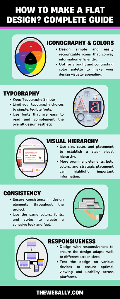
- Use Basic Iconography: Design simple and easily recognizable icons that convey information efficiently. Keep them clean and clear.
- Choose Vibrant Colors: Opt for a bright and contrasting color palette to make your design visually appealing. However, limit the number of colors to maintain simplicity and coherence.
- Keep Typography Simple: Limit your typography choices to simple, legible fonts. Use fonts that are easy to read and complement the overall design aesthetic.
By following these steps, you can create a clean and attractive flat design that effectively communicates your message while maintaining a modern and streamlined appearance.
- Establish Visual Hierarchy: Use size, color, and placement to establish a clear visual hierarchy. More prominent elements, bold colors, and strategic placement can highlight important information.
- Avoid Gradients, Textures, and Shadows: Keep the design clean and simple by eliminating gradients, realistic textures, and shadows. Stick to flat colors and simple shapes to maintain the flat design aesthetic.
- Maintain Consistency: Ensure consistency in design elements throughout the project. Use the same colors, fonts, and styles to create a cohesive look and feel. Employ a consistent grid system for alignment to maintain order and organization.
- Ensure Responsiveness: Design with responsiveness to ensure the design adapts well to different screen sizes and devices. Test the design on various devices to ensure optimal viewing and usability across platforms.
By following these principles, you can create a visually appealing and user-friendly flat design that effectively communicates your message across different platforms.
What does flat design mean to UI designers?
For UI designers, flat design represents a shift towards prioritizing functionality over mere aesthetic appeal. With flat design, the success of a UI is measured by the value it brings to the user experience rather than solely by its visual attractiveness. This focus on user experience allows designers to concentrate on creating intuitive and efficient interfaces, benefiting both businesses and customers.
What goes into a flat design?
Creating a flat design involves focusing on simple experiences and utilizing specific design elements:
- Strong, Contrasting Colors: Using bold and contrasting colors helps emphasize details within icons, illustrations, and other UI elements, drawing users’ attention to important information.
- Sans Serif Typography: Opting for large, easy-to-read fonts in a sans serif style indicates the purpose of icons or illustrations, enhancing usability and comprehension.
- Crisp, Clean UI Elements: Incorporating crisp and clean UI elements ensures the design is easy to see and understand, contributing to a visually consistent and functional UI.
By incorporating these elements, UI designers can create flat
designs that prioritize usability and functionality while maintaining a visually appealing and cohesive interface.
Conclusion
The key takeaway is that flat design offers a minimalist approach to UI design to simplify complexity and improve the user experience. While flat design is effective, it’s essential to recognize that it’s not the only approach to UI design.
Material design and skeuomorphism (rich design) are also viable options, each with strengths and considerations.
Researching user preferences and needs is crucial before deciding on a design approach. User input should inform the design process to ensure that the final UI meets their expectations and enhances their experience.
Therefore, while flat design offers benefits, it’s essential to tailor the design approach to the specific requirements and preferences of the target users.
If you need website development services in Malta, you can contact The Web Ally today!
All web designers need to constantly work on acquiring better skills for design. When designing, you begin to see everything in a new light.
Why is the scissor intended in the way that it is?
Why is one handle loop longer than the other? Every design is supposed to provide convenience for users, and your insight into every detail helps improve your skill constantly.
This is where Fitts’ Law comes in.
What is Fitts’ Law, and how can you boost your design skills? We will discuss this in detail so that you can improve your work style and become better at achieving convenient and valuable designs.
What is Fitts’ Law?
Fitts’ Law, proposed by psychologist Paul Fitts in 1954, explains that the time required for a person to move a pointer (e.g., mouse cursor) to a target area is influenced by the target’s distance and the target’s size. In simpler terms, the farther and smaller the target, the longer it takes to reach it.
This law is widely used in user experience (UX) and user interface (UI) design, especially when designing interactive elements like buttons.
For example, more prominent buttons are more accessible to click, which is crucial for finger-operated devices like mobile phones. Fitts’ Law emphasizes the importance of minimizing the distance between a user’s attention area and the related interactive element.
In practical terms, applying Fitts’ Law to web design means considering the size and placement of interactive elements.
For instance, essential buttons should be more prominent and closer to the user’s starting point. The law also suggests that corners and outer edges of the screen, known as “magic pixels,” are less accessible, so designers should avoid placing crucial elements there.
To summarize, Fitts’ Law helps predict user behavior on a website, guiding designers to create more user-friendly interfaces. It is often used in conjunction with other design principles for optimal results.
Using Fitts’ Law in Design
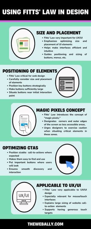
The significance of Fitts’ Law in the design landscape, particularly in the context of UX/UI, is profound. It underscores the imperative of considering the dimensions of interactive elements, with a keen focus on optimizing user interaction.
For instance, the law advocates for the enlargement of buttons, which is especially pertinent for devices operated by fingers, such as mobile phones. This emphasis on larger, more accessible buttons aligns with the broader goal of enhancing user efficiency.
Applying Fitts’ Law to web design entails meticulous attention to the size and placement of interactive elements. The Law’s tenets advocate for the strategic positioning of essential buttons, ensuring they are sufficiently large and situated near the user’s initial point of interaction.
The Law also introduces the concept of “magic pixels,” designating corners and outer edges of the screen as less accessible areas, urging designers to exercise caution when situating critical elements in these zones.
In everyday life, this principle appears straightforward.
The door button on a microwave is typically the most prominent because opening the door constitutes a critical action. In the realm of human-computer interaction, the concept is equally straightforward.
When your cursor is distant from a petite call-to-action (CTA), precision becomes essential for an accurate click, resulting in increased time and energy expenditure as you maneuver your mouse toward the CTA.
Conversely, precision becomes less crucial for a precise click when your cursor is close to a substantial CTA. This reduces time and energy consumption in navigating towards the CTA while achieving the same outcome.
Fitts’ Law finds extensive application in UX and UI design, particularly in interfaces involving pointing with a mouse or finger. It explains the rationale behind the generous sizing of call-to-action elements on websites.
Consider this: if you desire users to perform specific actions on your site, positioning sizable call-to-actions where users anticipate finding them ensures ease of discovery and interaction.
However, it’s essential to approach these guidelines with a degree of skepticism. While logic plays a role, it alone cannot orchestrate an exceptional user experience.
Human emotions propel behavior and draw us toward visually appealing and user-friendly objects.
Crafting a user-centric experience demands a profound understanding of human psychology.
Fitts’ Law and Web Design
Users can effortlessly make selections when an entire button or image is sizably conspicuous, clickable, and restricted by clear boundaries. The intuitive understanding of where to click and where not to bond is facilitated.
Conversely, requiring users to precisely aim their cursor at a specific part of a button, such as the text, demands greater precision, resulting in more time and effort.
Nevertheless, the adage “bigger isn’t always better” holds. Excessive enlargement of a button may yield diminishing returns in usability.
A button that surpasses a certain size threshold risks disrupting the visual equilibrium of a page and occupying valuable real estate that could be better allocated to white space or another call-to-action.
Optimal usability occurs when buttons are sufficiently large to command attention without compromising the visual balance of the page.
If you need help with your website design, our team at The Web Ally can help. Contact us now for more details.
We have all heard of the phrase “follow the breadcrumbs,” which stresses the act of tracing a sequence of scattered clues leading back to a specific person or place. Whenever you are lost, follow the breadcrumbs.
However, breadcrumbs have a different meaning when discussing User Interface (UI) design. The term “breadcrumbs” encompasses a similar concept.
Much like the trail of breadcrumbs meticulously left by Hansel and Gretel to navigate the woods without losing their way, UI breadcrumbs are an indispensable navigational tool for users exploring websites and applications.
So what are UI breadcrumbs, and when should one consider employing or avoiding them?
This comprehensive article aims to dive into the nuances of best practices for breadcrumbs, offering insights through a curated selection of illustrative examples.
What Are UI Breadcrumbs?
UI breadcrumbs are the standardized mechanism of finding a way, giving users the power to effortlessly explore various sections within the designed structure of a user interface or website.
Typically presented as a lineage of links resembling a family tree, these breadcrumbs delineate the current page and its predecessors.
Commencing with a link to the home page as the root node, subsequent pages are separated by symbols such as “/” or “>.” This breadcrumb trail is commonly positioned just below the website’s global navigation or main menu.
Exploring the Varied Types of UI Breadcrumbs:
UI breadcrumbs can be categorized into three distinct types:
• Location-Based Breadcrumbs:
These breadcrumbs highlight the user’s position within an interface or website’s page hierarchy.
• Attribute-Based Breadcrumbs:
They help users orient themselves by indicating information and categorizing the current page. Frequently employed in online marketplaces, this breadcrumb trail creates an “attribute tree,” handy for determining features and qualities when shopping for items. As exemplified during the search for sweatshirts on Depop:
Home > Clothing > Sweatshirts > Brand > Adidas
• Pathway-Based Breadcrumbs:
Pathway-based breadcrumbs illuminate users’ journey within a website or application. These breadcrumbs outline the pages visited, enhancing user awareness of their navigational path.
Pathway-based breadcrumbs offer a detailed account of every user’s steps to reach their current page within a user interface.
These breadcrumbs generate dynamically, reflecting each user’s unique navigation history as they traverse through the UI.
In a functional sense, pathway-based breadcrumbs can be a versatile tool, acting as a back or undo feature. This capability empowers users to seamlessly jump between site sections without worrying about losing their way in the digital landscape.
However, their utility can be questioned, considering users often navigate spontaneously and unpredictably, creating intricate and sometimes confusing paths.
Additionally, their effectiveness diminishes when users are directed into a deep UI section from an external source.
When Are UI Breadcrumbs Needed?
UI breadcrumbs prove most beneficial in large, multi-leveled hierarchical sites or systems where users may risk losing their way amidst twists and turns.
Conversely, implementing breadcrumbs may need to be revised on single-page sites or interfaces lacking logical grouping or hierarchy.
It is essential to note that UI breadcrumbs should never be viewed as a replacement for the UI’s global navigation system or the local wayfinding bar within a specific site section.
Instead, they should be regarded as a supplementary navigational component, enhancing the traditional menu at the top left of every site without rendering it obsolete.
Breadcrumbs and Polyhierarchical Sites:
A particular perspective suggests caution when showcasing multiple pathways in the architecture of a polyhierarchical website, where numerous “parent” pages link to a single page.
The concern is that illustrating multiple pathways may introduce clutter at the top of the page, potentially confusing users.
Nevertheless, exceptions may arise, especially for marketplaces dealing with products that defy easy categorization into a single genre. Such scenarios pose challenges in allocating a primary trail for particular items.
A closer exploration of this concept can be found in the fourth example provided later in this article.
These considerations underscore the nuanced approach required in applying UI breadcrumbs, ensuring their deployment aligns with the specific needs and structure of the digital environment they aim to enhance.
Breadcrumbs on Mobile:
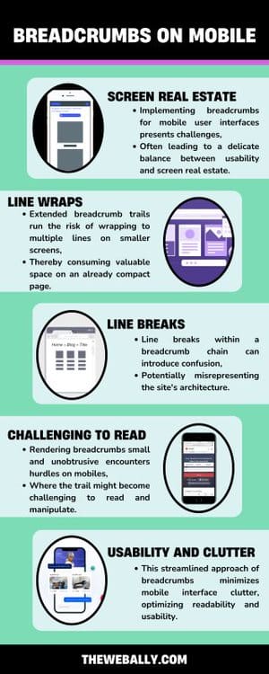
Implementing breadcrumbs for mobile user interfaces presents challenges, often leading to a delicate balance between usability and screen real estate.
Extended breadcrumb trails run the risk of wrapping to multiple lines on smaller screens, thereby consuming valuable space on an already compact page. Line breaks within a breadcrumb chain can introduce confusion, potentially misrepresenting the site’s architecture.
The traditional tactic of rendering breadcrumbs small and unobtrusive encounters hurdles on mobile devices, where the trail might become challenging to read and manipulate.
To address this, a practical solution involves shortening the trail to just one crumb, pointing up a level to the preceding ancestor page. This streamlined approach minimizes mobile interface clutter, optimizing readability and usability.
Breadcrumb Formatting:
Effective breadcrumb formatting plays a crucial role in ensuring a seamless user experience. Maintaining a significantly smaller font size than the surrounding text helps prevent the trail from becoming obtrusive.
As previously mentioned, each crumb is typically separated by a symbol, commonly represented as “/” or “>,” although less conventional symbols may serve the same purpose. The choice of dividers often involves aesthetic considerations.
Each crumb should be a clickable link except the one about the current page.
Ensuring that each link is functional prevents users from investing effort in a futile pursuit. To signify that the “current page” crumb is non-navigable, visual emphasis—such as underlining or distinct coloration—can be employed, saving users from attempting a non-productive interaction.
Contemporary UI breadcrumbs have evolved beyond a mere chain of links. The following section explores innovative and inspirational examples of breadcrumb designs.
Final Thoughts on UI Breadcrumbs:
In conclusion, UI breadcrumbs stand as a valuable supplement to navigation, providing users with an additional means to access pages within the intricate structure of an interface.
Their utility shines brightly in facilitating navigation within multi-layered, hierarchical sites, offering users a clear path through the digital landscape.
However, their implementation becomes redundant on single-level web pages, where the simplicity of the structure renders them unnecessary.
Typically, each node in the breadcrumb trail links to a relevant page, offering users a progressively specific journey as they delve deeper into the site’s content.
The trio of breadcrumb types—location, attribute, and path-based—presents diverse pathways through the architecture of the UI, catering to varied user preferences.
While breadcrumbs have undeniably become commonplace, it’s essential to recognize that they are not universally necessary.
In certain instances, their presence may introduce unnecessary clutter, duplicating the role of an existing menu.
Furthermore, in an era dominated by mobile usage, the challenge arises with long breadcrumb trails featuring tiny text, potentially compromising the user-friendly nature of this navigational tool.
As a parting note, it’s worth acknowledging that UI breadcrumbs, like any tool, should be employed judiciously based on a digital environment’s specific needs and structure.
If you need help with website design or adding breadcrumbs to your existing website, The Web Ally can help you.
Contact us now for more details.
Design is a multifaceted discipline that involves a combination of creativity, problem-solving, and aesthetics.
For User Experience (UX) designers, understanding and applying the principles of design is crucial in creating meaningful and effective user interfaces.
In this guide, we will explore the seven fundamental principles of design that serve as the cornerstone for UX professionals.
Principles of Design
Here are the main design principles:
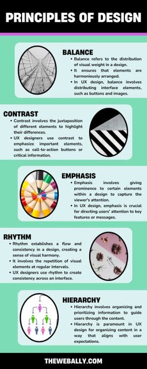
1. Balance: Achieving Equilibrium in Design
Balance refers to the distribution of visual weight in a design. It ensures that elements are harmoniously arranged, creating a sense of stability and equilibrium.
In UX design, balance involves distributing interface elements, such as buttons and images, to create a visually pleasing and user-friendly layout. Achieving balance ensures that users can navigate the interface intuitively without feeling overwhelmed.
2. Contrast: Enhancing Visual Hierarchy
Contrast involves the juxtaposition of different elements to highlight their differences. It aids in establishing a visual hierarchy and drawing attention to specific elements.
UX designers use contrast to emphasize important elements, such as call-to-action buttons or critical information. By employing contrasting colors, sizes, or styles, designers guide users’ focus and enhance the overall user experience.
3. Emphasis: Focusing User Attention
Emphasis involves giving prominence to certain elements within a design to capture the viewer’s attention. It helps convey the hierarchy of information.
In UX design, emphasis is crucial for directing users’ attention to key features or messages. Whether it’s a headline, a critical button, or an error message, emphasis ensures that users engage with the most important aspects of the interface.
4. Rhythm: Creating Visual Harmony
Rhythm establishes a flow and consistency in a design, creating a sense of visual harmony. It involves the repetition of visual elements at regular intervals.
UX designers use rhythm to create consistency across an interface. Consistent spacing, typography, and button styles contribute to a seamless and predictable user experience.
5. Proportion: Ensuring Visual Harmony
Proportion involves the relationship between different elements’ sizes in a design. It ensures that visual elements are appropriately sized relative to each other.
Proportion is essential in UX design for maintaining a balanced and visually appealing interface. Properly proportioned elements contribute to a cohesive and aesthetically pleasing user interface.
6. Unity: Coherence in Design Elements
Unity refers to the cohesion and coherence of elements in a design. It ensures that all design elements work together harmoniously to convey a unified message.
Achieving unity in UX design involves maintaining a consistent visual language throughout the interface. Consistent colors, fonts, and styling contribute to a unified user experience across different screens and interactions.
7. Hierarchy: Structuring Information Effectively
Hierarchy involves organizing and prioritizing information to guide users through the content. It establishes a clear structure that helps users understand the relative importance of different elements.
Hierarchy is paramount in UX design for organizing content in a way that aligns with user expectations.
By employing visual cues like size, color, and placement, designers ensure that users can easily navigate and comprehend the interface.
Conclusion
In the world of UX design, understanding and applying the seven principles of design is fundamental to creating interfaces that are not only visually appealing but also intuitive and user-friendly.
By mastering these principles, UX professionals can elevate their designs and deliver exceptional user experiences that resonate with users on both aesthetic and functional levels.
The Web Ally ensures each of these elements in its interface designs, so you can be sure of getting higher user engagement. To discuss your project further, contact our team today!