Flat design is a type of design for computer screens that uses simple, flat shapes and bright colors.
It’s different from another style called skeuomorphic, which tries to make things look three-dimensional by copying real-life details. You might have seen flat design on websites or apps like Windows 8, Apple’s iOS 7, and Google’s Material Design. We will discuss flat design in detail.
Flat Design: An Introduction
With the rise of personal computing, skeuomorphic design played a crucial role in introducing users, especially those unfamiliar with technology, to new concepts. Skeuomorphism simplifies UI by creating familiar real-life affordances, such as a trash can icon representing the action of deleting a file, making it easier for users to understand.
Over time, skeuomorphic design became more realistic, with detailed 3D renderings. However, many designers began to feel that this approach needed to be more varied. Users were becoming more tech-savvy, and the extra realism provided by 3D elements could have enhanced the user experience.
Flat design emerged as a response, rejecting the 3D aspects of skeuomorphism. Contrary to common belief, flat design doesn’t completely abandon skeuomorphism but instead focuses on simplifying elements into flat, minimalist forms. It avoids excessive gradients, textures, and drop shadows, instead opting for simple flat elements, clear typography, and straightforward color schemes.
Indeed, flat design has become ubiquitous and can be observed in various designs, including flat emoticons. Beyond aesthetics, flat design offers practical advantages, particularly in responsive design. Two-dimensional objects are more straightforward to scale within responsive designs that accommodate different screen or browser sizes.
This scalability is especially crucial in the era of the mobile web, where ensuring optimal viewing experiences across various devices is paramount. Therefore, flat design enhances visual appeal and facilitates seamless adaptation to different platforms, improving user experiences.
The flat design draws inspiration from various art forms, notably the Swiss Style (or International Typographic Style), Bauhaus, and Modernism. Among these influences, the Swiss Style has significantly impacted the development of flat design. While flat design gained popularity in the real world during the 1950s and 1960s, its adoption in the digital realm could have been faster.
An early example of digital flat design can be seen in Microsoft’s Zune MP3 player, released in 2006. The Zune interface was characterized by its clean and simple design, featuring lowercase typography in large font sizes, silhouette-style logos, and plain monochromatic fonts.
Although the Zune is no longer in production, its UI styling influenced subsequent Microsoft products, including Windows Phone and the Windows 8 operating system, which, despite criticism for other aspects, incorporated flat design principles.
The legacy of the Zune lives on in flat design despite its limited success in the MP3 player market. In 2013, Apple embraced flat design with the release of iOS 7, intentionally moving away from previous skeuomorphic designs.
The shift in flat design began with the increasing familiarity of users with touchscreen interfaces. The freedom of touching the screen with no need to press buttons is liberation from literal interpretations of the physical world allowed for a more abstract design environment, focusing on functionality rather than imitation.
While some may find flat design boring, Microsoft and Apple have embraced its simplicity and functionality. Minimalistic design styles have gained popularity because they prioritize usability by eliminating unnecessary clutter. Bright and contrasting colors in a flat design can draw attention to critical elements, effectively guiding users through the interface.
Ultimately, the appeal of flat design lies in its implementation. Attention-grabbing colors and strategic use of design elements can make flat designs visually engaging and intuitive to navigate.
Moreover, it’s easy to make a case for the effectiveness of flat design based on its simplicity. The minimalist approach of flat design ensures that the message is conveyed clearly and easily understood. By simplifying images and elements, the message becomes more accessible to users, enhancing overall usability and communication. Therefore, the simplicity inherent in flat design can be its greatest strength, facilitating effective communication and user engagement.
What is a flat design image?
A flat design image is a straightforward picture created in the flat design style. It uses simple shapes, vivid colors, and uncomplicated text. These images are commonly found on websites, apps, or in print. Flat design images prioritize simplicity and ease of use, making them tidy and user-friendly. They excel at conveying information clearly and efficiently, whether you’re browsing a website or using an app.
Originally, flat design was made to work well on different screen sizes, like on phones and tablets. It keeps things simple, using basic shapes and not too many fancy details, so it loads quickly, especially on devices with slower internet.
By keeping things clean and simple, flat design gives people a smooth experience when they use websites or apps.
But there’s a downside. Because flat design doesn’t have those 3D effects like shadows can sometimes make it hard for users to know what to click on or interact with. For example, buttons might not look like buttons, so users might not realize they can click on them. To fix this, designers are now mixing flat design with a bit of that 3D style, calling it “flat design
2.0” or “almost flat design.” This newer style still looks clean and simple but adds subtle details like shadows or different colors to make things easier to understand. Google’s Material Design and Apple’s iOS are good examples of this mix, using shadows to help users navigate their interfaces.
What is the benefit of flat design?
Flat design offers several advantages:
- Consistent Branding: It helps maintain a unified brand image across different platforms.
- User-Friendly Icons: Simple icons enhance user understanding and interaction.
- Reduced Cognitive Load: By avoiding complex textures and shadows, flat design makes it easier for users to process information.
- Contemporary Aesthetic: It aligns with modern design trends, giving a fresh, up-to-date look.
- Easy Maintenance: The simplicity of flat design makes it easier to update and maintain over time.
- Clean Interface: Simplified visual elements create a clutter-free and visually appealing interface.
- Faster Loading Times: Simple shapes and details help load faster, improving overall user experience.
What is modern flat design?
Modern flat design, or “flat design 2.0,” builds upon traditional principles while addressing its limitations. It maintains the simplicity of two-dimensional elements and vibrant color schemes but introduces subtle enhancements to enhance the user experience.
Key features of modern flat design include:
- Subtle Shadows or Gradients: Unlike traditional flat design, modern flat design incorporates gentle shadows or gradients to add depth and visual interest without compromising overall simplicity.
- Responsive Design: It prioritizes responsiveness, ensuring that designs adapt seamlessly to various screen sizes and devices. This adaptability enhances user experience across different platforms.
- Layering Techniques: Modern flat design utilizes layering techniques to establish a clear hierarchy of elements. By layering components, designers can guide user interaction and improve usability.
Overall, the modern flat design retains the clean aesthetic and user-friendly nature of traditional flat design while addressing its shortcomings to create a more refined and versatile design approach.
How Do You Make a Flat Design?
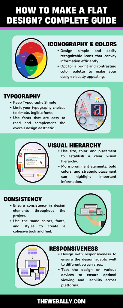
Creating a flat design involves these straightforward steps:
- Use Basic Iconography: Design simple and easily recognizable icons that convey information efficiently. Keep them clean and clear.
- Choose Vibrant Colors: Opt for a bright and contrasting color palette to make your design visually appealing. However, limit the number of colors to maintain simplicity and coherence.
- Keep Typography Simple: Limit your typography choices to simple, legible fonts. Use fonts that are easy to read and complement the overall design aesthetic.
By following these steps, you can create a clean and attractive flat design that effectively communicates your message while maintaining a modern and streamlined appearance.
- Establish Visual Hierarchy: Use size, color, and placement to establish a clear visual hierarchy. More prominent elements, bold colors, and strategic placement can highlight important information.
- Avoid Gradients, Textures, and Shadows: Keep the design clean and simple by eliminating gradients, realistic textures, and shadows. Stick to flat colors and simple shapes to maintain the flat design aesthetic.
- Maintain Consistency: Ensure consistency in design elements throughout the project. Use the same colors, fonts, and styles to create a cohesive look and feel. Employ a consistent grid system for alignment to maintain order and organization.
- Ensure Responsiveness: Design with responsiveness to ensure the design adapts well to different screen sizes and devices. Test the design on various devices to ensure optimal viewing and usability across platforms.
By following these principles, you can create a visually appealing and user-friendly flat design that effectively communicates your message across different platforms.
What does flat design mean to UI designers?
For UI designers, flat design represents a shift towards prioritizing functionality over mere aesthetic appeal. With flat design, the success of a UI is measured by the value it brings to the user experience rather than solely by its visual attractiveness. This focus on user experience allows designers to concentrate on creating intuitive and efficient interfaces, benefiting both businesses and customers.
What goes into a flat design?
Creating a flat design involves focusing on simple experiences and utilizing specific design elements:
- Strong, Contrasting Colors: Using bold and contrasting colors helps emphasize details within icons, illustrations, and other UI elements, drawing users’ attention to important information.
- Sans Serif Typography: Opting for large, easy-to-read fonts in a sans serif style indicates the purpose of icons or illustrations, enhancing usability and comprehension.
- Crisp, Clean UI Elements: Incorporating crisp and clean UI elements ensures the design is easy to see and understand, contributing to a visually consistent and functional UI.
By incorporating these elements, UI designers can create flat
designs that prioritize usability and functionality while maintaining a visually appealing and cohesive interface.
Conclusion
The key takeaway is that flat design offers a minimalist approach to UI design to simplify complexity and improve the user experience. While flat design is effective, it’s essential to recognize that it’s not the only approach to UI design.
Material design and skeuomorphism (rich design) are also viable options, each with strengths and considerations.
Researching user preferences and needs is crucial before deciding on a design approach. User input should inform the design process to ensure that the final UI meets their expectations and enhances their experience.
Therefore, while flat design offers benefits, it’s essential to tailor the design approach to the specific requirements and preferences of the target users.
If you need website development services in Malta, you can contact The Web Ally today!
All web designers need to constantly work on acquiring better skills for design. When designing, you begin to see everything in a new light.
Why is the scissor intended in the way that it is?
Why is one handle loop longer than the other? Every design is supposed to provide convenience for users, and your insight into every detail helps improve your skill constantly.
This is where Fitts’ Law comes in.
What is Fitts’ Law, and how can you boost your design skills? We will discuss this in detail so that you can improve your work style and become better at achieving convenient and valuable designs.
What is Fitts’ Law?
Fitts’ Law, proposed by psychologist Paul Fitts in 1954, explains that the time required for a person to move a pointer (e.g., mouse cursor) to a target area is influenced by the target’s distance and the target’s size. In simpler terms, the farther and smaller the target, the longer it takes to reach it.
This law is widely used in user experience (UX) and user interface (UI) design, especially when designing interactive elements like buttons.
For example, more prominent buttons are more accessible to click, which is crucial for finger-operated devices like mobile phones. Fitts’ Law emphasizes the importance of minimizing the distance between a user’s attention area and the related interactive element.
In practical terms, applying Fitts’ Law to web design means considering the size and placement of interactive elements.
For instance, essential buttons should be more prominent and closer to the user’s starting point. The law also suggests that corners and outer edges of the screen, known as “magic pixels,” are less accessible, so designers should avoid placing crucial elements there.
To summarize, Fitts’ Law helps predict user behavior on a website, guiding designers to create more user-friendly interfaces. It is often used in conjunction with other design principles for optimal results.
Using Fitts’ Law in Design
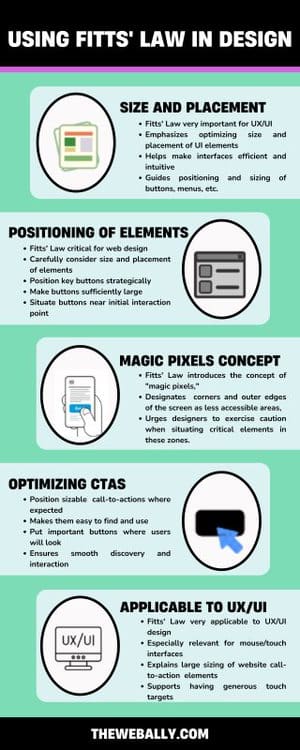
The significance of Fitts’ Law in the design landscape, particularly in the context of UX/UI, is profound. It underscores the imperative of considering the dimensions of interactive elements, with a keen focus on optimizing user interaction.
For instance, the law advocates for the enlargement of buttons, which is especially pertinent for devices operated by fingers, such as mobile phones. This emphasis on larger, more accessible buttons aligns with the broader goal of enhancing user efficiency.
Applying Fitts’ Law to web design entails meticulous attention to the size and placement of interactive elements. The Law’s tenets advocate for the strategic positioning of essential buttons, ensuring they are sufficiently large and situated near the user’s initial point of interaction.
The Law also introduces the concept of “magic pixels,” designating corners and outer edges of the screen as less accessible areas, urging designers to exercise caution when situating critical elements in these zones.
In everyday life, this principle appears straightforward.
The door button on a microwave is typically the most prominent because opening the door constitutes a critical action. In the realm of human-computer interaction, the concept is equally straightforward.
When your cursor is distant from a petite call-to-action (CTA), precision becomes essential for an accurate click, resulting in increased time and energy expenditure as you maneuver your mouse toward the CTA.
Conversely, precision becomes less crucial for a precise click when your cursor is close to a substantial CTA. This reduces time and energy consumption in navigating towards the CTA while achieving the same outcome.
Fitts’ Law finds extensive application in UX and UI design, particularly in interfaces involving pointing with a mouse or finger. It explains the rationale behind the generous sizing of call-to-action elements on websites.
Consider this: if you desire users to perform specific actions on your site, positioning sizable call-to-actions where users anticipate finding them ensures ease of discovery and interaction.
However, it’s essential to approach these guidelines with a degree of skepticism. While logic plays a role, it alone cannot orchestrate an exceptional user experience.
Human emotions propel behavior and draw us toward visually appealing and user-friendly objects.
Crafting a user-centric experience demands a profound understanding of human psychology.
Fitts’ Law and Web Design
Users can effortlessly make selections when an entire button or image is sizably conspicuous, clickable, and restricted by clear boundaries. The intuitive understanding of where to click and where not to bond is facilitated.
Conversely, requiring users to precisely aim their cursor at a specific part of a button, such as the text, demands greater precision, resulting in more time and effort.
Nevertheless, the adage “bigger isn’t always better” holds. Excessive enlargement of a button may yield diminishing returns in usability.
A button that surpasses a certain size threshold risks disrupting the visual equilibrium of a page and occupying valuable real estate that could be better allocated to white space or another call-to-action.
Optimal usability occurs when buttons are sufficiently large to command attention without compromising the visual balance of the page.
If you need help with your website design, our team at The Web Ally can help. Contact us now for more details.
Design is a multifaceted discipline that involves a combination of creativity, problem-solving, and aesthetics.
For User Experience (UX) designers, understanding and applying the principles of design is crucial in creating meaningful and effective user interfaces.
In this guide, we will explore the seven fundamental principles of design that serve as the cornerstone for UX professionals.
Principles of Design
Here are the main design principles:
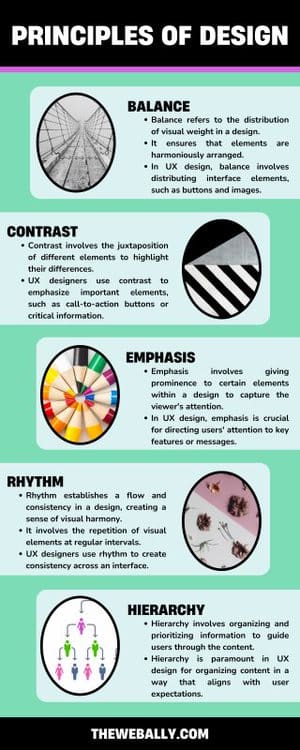
1. Balance: Achieving Equilibrium in Design
Balance refers to the distribution of visual weight in a design. It ensures that elements are harmoniously arranged, creating a sense of stability and equilibrium.
In UX design, balance involves distributing interface elements, such as buttons and images, to create a visually pleasing and user-friendly layout. Achieving balance ensures that users can navigate the interface intuitively without feeling overwhelmed.
2. Contrast: Enhancing Visual Hierarchy
Contrast involves the juxtaposition of different elements to highlight their differences. It aids in establishing a visual hierarchy and drawing attention to specific elements.
UX designers use contrast to emphasize important elements, such as call-to-action buttons or critical information. By employing contrasting colors, sizes, or styles, designers guide users’ focus and enhance the overall user experience.
3. Emphasis: Focusing User Attention
Emphasis involves giving prominence to certain elements within a design to capture the viewer’s attention. It helps convey the hierarchy of information.
In UX design, emphasis is crucial for directing users’ attention to key features or messages. Whether it’s a headline, a critical button, or an error message, emphasis ensures that users engage with the most important aspects of the interface.
4. Rhythm: Creating Visual Harmony
Rhythm establishes a flow and consistency in a design, creating a sense of visual harmony. It involves the repetition of visual elements at regular intervals.
UX designers use rhythm to create consistency across an interface. Consistent spacing, typography, and button styles contribute to a seamless and predictable user experience.
5. Proportion: Ensuring Visual Harmony
Proportion involves the relationship between different elements’ sizes in a design. It ensures that visual elements are appropriately sized relative to each other.
Proportion is essential in UX design for maintaining a balanced and visually appealing interface. Properly proportioned elements contribute to a cohesive and aesthetically pleasing user interface.
6. Unity: Coherence in Design Elements
Unity refers to the cohesion and coherence of elements in a design. It ensures that all design elements work together harmoniously to convey a unified message.
Achieving unity in UX design involves maintaining a consistent visual language throughout the interface. Consistent colors, fonts, and styling contribute to a unified user experience across different screens and interactions.
7. Hierarchy: Structuring Information Effectively
Hierarchy involves organizing and prioritizing information to guide users through the content. It establishes a clear structure that helps users understand the relative importance of different elements.
Hierarchy is paramount in UX design for organizing content in a way that aligns with user expectations.
By employing visual cues like size, color, and placement, designers ensure that users can easily navigate and comprehend the interface.
Conclusion
In the world of UX design, understanding and applying the seven principles of design is fundamental to creating interfaces that are not only visually appealing but also intuitive and user-friendly.
By mastering these principles, UX professionals can elevate their designs and deliver exceptional user experiences that resonate with users on both aesthetic and functional levels.
The Web Ally ensures each of these elements in its interface designs, so you can be sure of getting higher user engagement. To discuss your project further, contact our team today!
In our interconnected world, reaching a global audience often requires breaking down language barriers. If you’re eager to expand your WordPress website’s reach and engage with visitors from diverse linguistic backgrounds, creating a multilingual website is the key.
This step-by-step guide will walk you through the process of transforming your WordPress site into a welcoming, multilingual space.
How to Build a Multilingual WordPress Website:
The foundation of a multilingual WordPress website lies in a reliable multilingual plugin. Popular choices include WPML (WordPress Multilingual), Polylang, and Weglot.
Install and activate your chosen plugin from the WordPress dashboard, ensuring compatibility with your theme.
In this guide, we’ll walk you through the entire process using the Translate Press plugin:
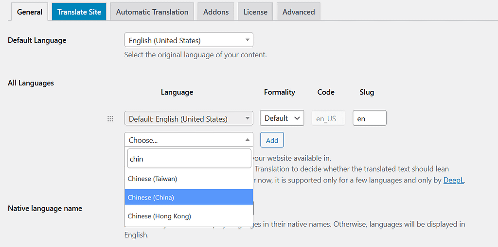
1. Configure Plugin Settings:
Once installed, navigate to the plugin settings to configure your website’s language settings. Set the default language and add additional languages you want to support. These settings will serve as the framework for your multilingual content.
For example, if your site is in English, and you want it to be in Chinese as well, you will configure it like this:
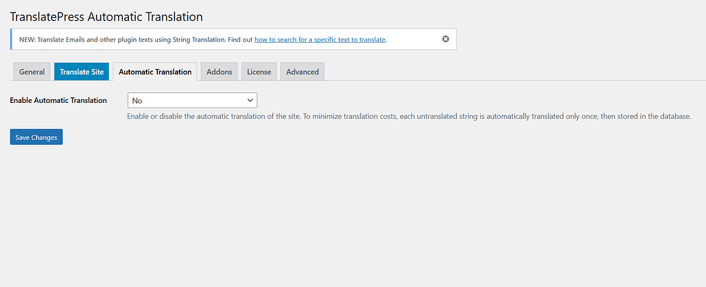
2. Enable Automatic Translation:
This is totally up to you, but you can either automatically translate your website or not. You can change the settings by clicking on the automatic translation tab. The plugin will use machine translation to adjust the content into a preferred language if you enable automatic translation.
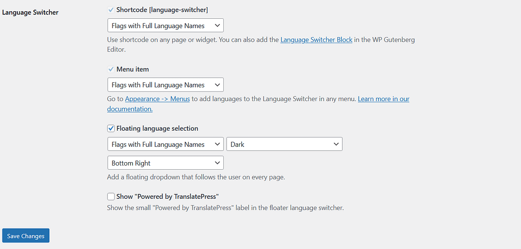
3. Language Switcher:
Make navigation seamless for your visitors by implementing language-switching options. This can be in the form of a language switcher in your website’s header or footer. Allow users to choose their preferred language and ensure that the switch is smooth and intuitive.
-
Start with the Translation:
All done! You are ready to translate your WordPress website into a different language. You can also use a visual interface to translate the content on your site. To apply the settings, click the translate page button in the admin toolbar.
It is pretty easy to navigate through the panel; you can select a floating switcher to change the language automatically. You will face any difficulty; it is more like a WordPress customizer.
5. Optimize SEO for Multilingual Content:
Boost the visibility of your multilingual website by optimizing it for search engines. Ensure that each language version has its own SEO settings, including meta titles, descriptions, and language-specific keywords. This ensures that your content is effectively indexed in different languages.
6. Consider Regional Variations:
If your target audience spans multiple regions with variations in language (e.g., American English vs. British English), take this into account during the translation process. Some multilingual plugins allow for regional variations, allowing you to tailor your content to specific linguistic nuances.
7. Test and Optimize:
Before launching your multilingual WordPress website, thoroughly test each language version. Check for consistency in design, functionality, and content across all translations. Pay attention to the user experience and ensure that language switching is seamless.
8. Leverage Translation Services for Dynamic Content:
For dynamic content such as user-generated comments or e-commerce product descriptions, consider integrating with translation services. This ensures that all aspects of your website, including user interactions, are accessible in multiple languages.
Things To Consider:
It is important to understand that you are creating a multilingual website to attract visitors. Hence, it is not just about translation; it is also about making context with the content. Moreover, you need to localize your content if you translate it into a different language. Keep in mind the following practices before you proceed with creating a multilingual WordPress website.
-
Cultural Differences:
There are around 6500+ languages, and with so many cultures and languages, it is difficult to translate between the languages. Words can be defined, but they lose the context. Not every word on your website needs to be translated well into another language, and that goes for slang phrases as well. Consider both literal and cultural meanings to avoid confusion.
-
URL Customization:
The main purpose of creating a multilingual website is to attract new visitors who understand a different language. Instead of using cookies to adjust the content, use different URLs for each version. This practice will also make the visitor with a different language feel more important.
-
Language Specification:
Yes, you can create a website in more than one language, but you can still develop it in some languages. It is not an efficient way to develop your website that matches your target audience.
Conclusion:
Creating a multilingual WordPress website opens doors to a more inclusive and diverse audience.
By following these steps, you can seamlessly implement multilingual features, providing a user-friendly experience for visitors regardless of their language.
Break down barriers, expand your reach, and create a global online presence with a multilingual WordPress website. If you need help in the website design process, professionals from The Web Ally are always here to help you.

Did you know that the same global factories supply multiple brands with their items? For example, the same supplier in India, C.L. Gupta Exports, Ltd., provides products for Pier 1, Target, IKEA, Crate & Barrel, Restoration Hardware, and Ashley Furniture.
The item itself is the same, but the label and pricing are entirely different. This is the essence of white label clothing—that is, the manufacturer that creates the product is very different from the one who sells it to the final customer.
But white label can apply to app development or software development as well. Read on to find out the basics of white label development and if it’s for you.
What Is White Label Development?
Perhaps you are thinking about creating an app or software, but you don’t have the team to create one. So what can you do? You find someone else to create the app for you, right?
Well, there are white label developers all over who specialise in doing just that. They are like the ghostwriters of the app or software development world.
Ghostwriters write a novel or article, but when the book or article gets published, it has an entirely different name on it.
James Patterson is well-known in the industry for being a prolific writer, but he doesn’t write a lot of his books himself. His ghostwriters do. Patterson just outlines them.
Sometimes ghostwriters are given credit on the book covers as co-authors. But in the case of white label app development, that never happens.
The white label developer will create the app, based on your specifications, and then you are free to market and sell the app as you wish. Your name, and no one else’s, appears on the app as the seller.
You are free to sell the app to other customers or other businesses. That’s your prerogative.
Advantages of Using a White Label Developer
As you can imagine, there are many advantages to using a white label developer rather than finding a team to create the software or app on your own. Let’s look at some of them below.
Quicker Turnaround Time
Because white label developers have a huge team who are focused entirely on the business of app and software development, you know that you are going to get what you requested in record time. It’s incomparable to how long it would take you to build a team of talented people and get them to build your app.
It’s also much better than hiring someone off Fiverr or some other freelance site and getting them to build your app. There are no communication problems, and everything is done up to your high standards.
More Cost-Effective
Since developers will take less time to build the app, you can start selling it sooner. Thus, you can start getting your investment back quicker. This makes the whole endeavor cost-effective.
Look at the big picture when hiring a white label developer. Even if they charge a higher up-front fee, they are much cheaper in the long run, as you will spend less time chasing them to get a quality finished product.
White Label Developers Have Immense Experience
White label development companies are experts in creating white label apps and software. They do this day in and day out for dozens of companies like you. This immense experience is something that you will appreciate when the entire buying process from start to finish is seamless.
No Need to Worry About Maintenance
The white label developer is responsible for updates, upkeep, and upgrade of the white label app. They will also host and monitor the app on their servers. This means you don’t have to worry about all this, and you can focus entirely on marketing and selling the app to your customers, either B2C or B2B.
Minimises Stress
The entire white label development process is stress-free for you as a customer. This is not their first turn around the merry-go-round. They have done this before for many other companies, so they have honed and perfected their process to a T.
You can benefit from all that experience. In no time, you will have the app that you wish to sell to your customers, and you don’t have to worry about legal complications or anything like this, since the app was yours from the moment they started building it.
It All Starts with a Consultation
When you decide that you are interested in creating a complex app, the first thing you need to do is have a consultation with a white label developer. During this consultation phase, a bit of brainstorming will happen to delineate exactly what you wish for your app to do.
Some things that will be outlined are:
- The best features you wish to include
- The target users of your app
- What you want the finished app to look like
With all this information in mind, the white label development team will know if their team is best for what you are looking for. If it is, then they will go off and start their work, once the contract is signed.
The app development process will depend on how many features you want and how complex the app is. Everything within the app will fit your company’s aesthetic and branding. This is ensured from the very beginning.
You are not alone when it comes to the app launch either. With the assistance of the white label developer, your app launch will go glitch-free. The app development team will support you even post launch to ensure everything runs smoothly.
Ready to Hire a White Label Developer?
When you search through all the development options you have and look at the advantages of using a white label developer, the choice is absolutely clear. If you already know what kind of software or app you wish to create, then contact us today. The Web Ally Development Studio is ready to become your invisible partner in building your dream app.
With hundreds of options to create and host your website, not to mention design tools, plugins, and website analyzers, what do you choose?
Is WordPress good for your specific purposes?
WordPress is an ideal option for everyone in need of a custom-designed website, no matter if your goal is building a business, increasing sales, starting a blog, or building a professional portfolio.
Keep reading to learn more about why WordPress is the perfect choice for your website.
What is WordPress?
The WordPress platform allows you to build and host your website. It’s extremely customizable and is ideal for any number of purposes.
Over the years, WordPress has evolved from a site on which to blog, to a full-grown hosting platform where you can run a blog, website, or eCommerce store.
WordPress.com vs WordPress.org
As you begin looking at website options, you might come across both WordPress.com and WordPress.org.
So why do these three little letters make a big difference?
WordPress.com is a free platform that you can use to create your own blog. You’ll have very limited materials to work with compared to those who host with WordPress.org, with one major difference that stands out.
Your website will be followed by “.WordPress.com” instead of just “.com”.
For example, imagine your domain name is Epic Cake World. If you decide to go with the free option when clients type in your web address it will read www.epiccakeworld.WordPress.com instead of epiccakeworld.com.
It’s worth purchasing your own domain name! It makes you seem more serious and professional.
WordPress.com
WordPress.com has quite a few drawbacks beyond the domain name, the only real pro being that WordPress backs up your site for you and it’s free (but limited). Some of the negatives include:
- Limited storage
- WordPress places their own ads (you don’t make money and can’t set up your own ads)
- No custom themes
- You can’t upload your own plugins
- No eCommerce features
WordPress.org
WordPress.org has so many pros in comparison to WordPress.com, it’s hard to see why you would choose any other option. Just a few of the advantages are:
- You own your website and all of its data
- You can earn money from website ads
- eCommerce abilities
- Ability to create membership platforms
- Your site is completely customizable
Why Choose WordPress?
WordPress is ideal because of the flexibility it offers. If you’re not quite sure what coding or HTML is, you’ll still be able to build the site of your dreams.
But beyond choosing WordPress.org over WordPress.com, why go with WordPress at all?
Open Source Software
WordPress offers open-source software which means that you’ll have access to a huge database of free plugins, themes, and resources.
Reliability and Ease of Use
WordPress has long been a pillar of the website building community.
It is known by everyone who builds websites and there are many resources and help guides available to make your WordPress journey easy.
There are even Facebook groups out there, created with the sole purpose of WordPress support from other users.
Features Galore
WordPress is constantly growing and changing. Features are always being added, plugins are frequently updated, and if you can’t figure out how to change something, there’s definitely a feature for it, you might just have to dig.
SEO Friendly
Search engine optimization is a business in and of itself, and while it takes time to understand and master, know that WordPress is SEO friendly. With a bit of elbow grease, you’ll be able to start ranking on the first page of search engines like Google, Bing, and Yahoo.
Is WordPress Good for Businesses?
If you’re not sure if WordPress is good for businesses, why not look at what some of the biggest businesses in the game use. Some companies that use WordPress include:
- Tech Crunch
- The New Yorker
- BBC America
- The Official Star Wars Blog
- Variety
- Sony Music
- MTV News
- Beyonce
- Microsoft New Center
WordPress is ideal for businesses because of its incredible potential. Anything you can dream can be done on WordPress.
But what about small businesses?
If you don’t have millions as part of your website budget like many of these brands, don’t fret!
WordPress is a great choice for small businesses as well.
Is WordPress Good for Professionals?
Almost everyone has a website these days. A website is the new resume. Whether you’re a business mogul, an artist, or anything in between, you should build a professional website to showcase your work and skills.
WordPress is ideal for professionals because it requires zero coding skills! All you need to do is find a theme you love and start writing!
You’ll also find a huge variety of free add-ons (such as plugins) that can help you modify your website.
WordPress websites are also easily mobilized without you having to do any work on your end.
With just over half of all web traffic being generated from mobile devices, you need to have a website that can be accessed and look great when someone is on their phone. Plus, mobile marketing could mean double your profits.
WordPress also provides easy social media integration. Clients and employers want to know what kinds of people we are online.
Linking to your socials from your professional website means that you direct them there, presenting an air of honesty and openness.
If you’ve got clients, you might just turn them into followers too!
Get Started Today
So is WordPress good for professionals and businesses?
The answer is a resounding YES!
There’s no doubt that WordPress can handle the need of every individual and business.
Now, we know that you’re busy, so why not let us do the work for you.
Do you need to redesign your website? Our team is here to help you!
Contact us today to see how The Web Ally can help your business succeed.
There are a lot of different elements that go into web design, and failing to use these elements properly can be detrimental to your site.
Using the proper web design elements can make a huge difference for your website, increasing traffic and keeping people on the site for longer. Nobody likes a confusing or complicated website, and it should be a breeze to navigate through and a pleasure to look at.
Luckily, there are some very simple things you can do to give your site the boost it needs.
Here are the most important web design elements to employ if you want your website to stand out from the crowd.
Colour Scheme
One of the most important aspects of any website is the colour scheme. It’s not something everyone will notice right away, but to the subconscious mind, it can make or break your browsing experience.
Use too many colours and your website is going to be hard on the eyes. Use too little and it comes off as boring, or uninventive. The trick is to use a few complementary colours rather than a lot of colours simply to make the website vibrant.
Use colours that complement your business and take into account how they work with the whitespace around your site. Even if you only use two or three colours throughout, this will make your site look more uniform and professional.
Typography
From font to font size, typography is another very important design element. You want your website to be easy to read, and you want to draw your visitors’ eyes to all the right places. Good typography is the way to do it.
You should not only strive for a readable font, but a unique one. Some companies are instantly recognizable through their fonts, and because of it some people will instantly think of your website or company whenever they see that font. The more you get people thinking of you, the better.
White Space
The worst sites are cluttered and messy. Not every square inch of your site needs to be filled with an image or text; in fact, it would be a mistake to try and force it.
Simple is often better. Companies like Apple have capitalized on this to great effect with their heavy use of white space in everything they do. The Google home page is another great example, where everything around the search bar and the Google logo is white, leading the customers’ eyes right where they need to go.
Of course, that doesn’t mean you need to just make everything white, but using white space properly will lead the eyes to the places that aren’t white. Colour or text will stand out much better, and tell the visitor where to look.
SEO-Elements
While not necessarily a visual design element, following SEO practices is an important element in the designing of any website today. If you’re not implementing SEO-elements into your website, it’s something to consider.
SEO means search engine optimised. That’s words and phrases that are Googled/searched more frequently, including the text on the site itself down to the meta tags and alt tags. Getting into the nitty-gritty of SEO can be a little time consuming, but even just familiarizing yourself with the basics will help you drive traffic to your website.
Navigation
You should always consider what’s best for the visitor when designing a web page, and this starts with making the site easy to navigate. How you do this depends entirely on your website, as there are a few ways to accomplish it.
Some choose to put their navigation menus at the top of the site in a row, and some use a ‘burger’, or drop-down menu: those three little horizontal lines that open up menu options when clicked or tapped. These work well for mobile, but they hide your navigation menu entirely when not in use which can lead to confusion or missed opportunities for new visitors.
Always help guide the visitor through your site, and make everything’s place obvious. Use directional arrows, in-text links, a ‘back to the top’ button for those long-scrolling pages, and anything else that can help give visitors an easy experience. Guaranteed they’ll stay longer and have a good look around if it’s easy to do.
Optimise for Speed
If your website isn’t fast to load and fast to navigate, people won’t be willing to give it the time of day. Ultimately, a lot of speed comes down to the design of the site and how you set it up.
Some simple things you can do to speed your site up is optimise all photos that you put on the site, using a CDN, and hosting your site through a dedicated server or shared hosting. Do some research into your hosts before making a choice, as some are definitely faster than others.
You’ll also want to keep plugin use to a minimum and think about implementing website caching if you’ve got a high level of traffic. A cached page doesn’t send database requests when each new person visits, meaning a much faster load time.
The Importance of Web Design Elements
A well-designed website will make all the difference in the world for you, whether you’re running a business, a portfolio site, or anything in-between. The more research and learning you do into web design elements, the more prepared you’ll be to wow your visitors and bring more traffic in. There are even plenty of eager website design agency workers who would be happy to make your website everything it can be.
Take into account all the web design elements you’ve learned here, and make that website the best it can be!
For more articles like this, check out the other stories on our blog. Feel free to contact us with any comments, questions, or concerns. We’d be happy to hear them.
Do you need to re-design your website? Our team is here to help you!
Contact us today to see how The Web Ally can help your business succeed.
Did you know that there are over 1.94 billion active websites around the world today?
This huge number makes competition for traffic stiff. It’s vital to invest in your website’s user experience to beat the competition. And one thing that can break or make your visitor’s experience is website navigation.
Navigating a site that lacks a well-defined and logical structure is more likely to lose traffic. It’s frustrating, overwhelming, and all-around unpleasant.
Therefore, you must create a more engaging and easy-to-navigate website. To do that, consider the pointers below:
1. Get Rid of Long Drop-Down Menu
If your drop-down menu feature options that seem extensive, unfamiliar, or fairly complex, consider replacing it.
In fact, very long drop-down menus can annoy, and therefore need to get replaced with a well-detailed page. So, instead of cramming up all your products in a drop-down menu, create a page to showcase them extensively.
You should also incorporate accompanying visuals to ensure that it’s easy for a customer to find the right option.
Make sure that your site’s navigation is simple and uncluttered to avoid confusing and overwhelming users.
2. Make Searching Frictionless
Notably, websites that feature a “site search” function convert more leads into sales because visitors can find products/services easily.
Yes, visitors who search through your site have the intent to act or buy. Thus, featuring a search bar will satisfy your customers’ “I want it now” attitude.
Also, a search bar allows people to quickly key in keyword phrases and find what they want, instead of having to sift through a confusing navigational structure.
A search function will make your website customer-centric. This is beneficial considering that you’re catering to a variety of internet users including prospects, buyers, long-term customers, and knowledge seekers.
3. Build Separate Menus for Dissimilar Audiences
If you’re offering services to two or more distinct groups, consider incorporating a design interface that offers easy navigation for the different users.
This includes dividing your links into two so that visitors can view the pages they want without having to sift through irrelevant content. Also, optimize all your secondary entry points so that their landing pages offer a specific user experience.
For instance, if you’re your catering to two audiences, say employers and job-seekers, have two distinguishable links for each group.
It’s important to identify the main audience for whom the call to action and the main content will be written to. You can do this by:
- Organizing a poll for stakeholders to vote on who’s the site’s most important audience
- Determining your site’s most important audiences in terms of conversions
- Figuring out the audience that accesses your site with the most frequency
You can also make use of visitor tracking to find more information about your target audience.
4. Provide Context
Most high-ranking websites use clues within their drop-down menus so that visitors can find a particular page with one click.
Without a doubt, clues go a long way in making your site easy to navigate. A clue can be a visual, a handy icon, or any other useful piece of info.
For instance, you can include bracketed numbers to show how many entries are in each of your subcategories.
Many a time, website product or category names appear technical to a time-bound visitor, which is why clues make a serious difference in navigability.
Clues can also help prevent the agonizing experiences website mobile users go through because of clunky controls, decreased screen legibility, and slower loading times.
5. Add a Fat Footer
If your website features a complex hierarchy, users are more likely to experience navigational fatigue because of having to expand sub-menu upon sub-menu.
Fat footers are an ideal solution because they enable visitors to see your entire site from a bird’s-eye view. This enables prospects to easily and quickly find a particular service, as soon as they land on your page.
A flat footer is also an excellent way to improve your local SEO.
6. Organize Your Menu Strategically
Neurobiological and behavioural evidence shows that recency and primacy get sub-served by the memory systems for short-term and intermediate memory respectively.
People are likely to experience the serial position effect when reading through lists on your website. Meaning that they’ll probably remember only the last and first items on that list.
Luckily, you can design your website to take advantage of this effect by placing your most important products or services at the end and beginning of your menu.
7. Be Specific
All your navigation labels ought to be clear and straightforward.
Because fancy terms and language may seem trendy, most visitors find them confusing and annoying. So just stick to user-friendly language.
Also, incorporate detailed labels so that new visitors can quickly identify what you offer. For example, instead of labelling a category as “products” label it as “handbags”. This will also help improve your site’s search engine optimization.
It’s important to incorporate clearly displayed breadcrumbs to help your visitors trace their movements in the website.
8. Incorporate Sticky Navigation
Fixed or sticky navigation is basically a website menu that gets locked into place.
This way, it doesn’t disappear as a user scrolls down the site’s main page. Now, sticky menus and bars can be advantageous or disadvantageous depending on your site’s navigation and design purposes.
One benefit is that they increase retention while making it easier for users to view the homepage after browsing through various pages. Think of them as a call to action that’s always available and visible.
9. Use Web Conventions
Web conventions are a set of ground rules used by designers to meet online user expectations.
Website design conventions are so impactful that you can visit a site that’s in a foreign language and still navigate your way around it. Therefore, to create an easy-to-navigate website, don’t attempt to re-invent the wheel.
Follow the same set of rules used by successful designers all over the world. That’s unless you’re sure there’s a better way to designing your website.
Invest in Better Website Navigation
Ultimately, the easier it is to navigate your website, the more time visitors will spend browsing through it. Therefore, invest in a quality website navigation system.
For help with developing and designing your website, look no further than The Web Ally.
Do you need to re-design your website? Our team is here to help you!
Contact us today to see how The Web Ally can help your business succeed.
Your homepage is like the entrance to a super-duper, all bells and whistles luxury car showroom.
If you’ve ever been in the market for a luxury car, you might remember the sparkling clean entrance, the comfy customer seating, and the smell of brewing coffee. An Espresso, you say? Don’t mind if I do.
In the same way, you want to show your potential customers that you’ve got the goods. Whatever the products and services you offer, you need to incorporate dynamic website design.
Keep your website clean and polished, and you’ll enjoy traffic to your site all day long. Is your website in need of a revamp? Read more to learn how you can give visitors a great user experience with dynamic website design.
1. Less is More
In the world of successful websites, you’ll quickly see that the simpler they are, the better.
Of course, you want to wow your visitors with cool graphics, funky fonts, and iconic images. But in web-design, you can have too much of a good thing, and that’ll put off visitors.
Too many images and colors (we’ll discuss these later) can feel confusing and claustrophobic. Instead, dynamic web design uses images strategically, to make a point.
Of course, if you’re selling items then you’ll want your images to stand out. For e-commerce sites, make sure your images are uniform in size and shape, and you leave a good amount of space between each one, so users can easily spot the item they’re looking for.
2. Build in SEO
SEO stands for Search Engine Optimization, and it’s like the behind-the-scenes makeup artist in the world of websites.
With dynamic website design, what users see is a website that’s easy to use and fun to read. Those are some of the things that make them sit back, get comfortable and stay engaged.
When you build in SEO, though, you suddenly become way more attractive to search engines like Google, Yahoo, and Bing.
The bottom line is, your page gets bumped up in their search results. When a customer searches for something you can give them, yours will be one of the first names they see.
3. Make it Mobile-First
If you’re redesigning your website, the best thing you can do to future-proof is to go mobile-first.
With almost all of us owning or having access to a mobile device, mobile internet traffic overtook desktop traffic in 2015. This shows us 2 main things.
First, dynamic website design involves creating an easy-to-use site that’s accessible to both desktop and mobile users.
Secondly, if you mess up and focus on just one group, you’ll be alienating a massive section of the market.
But why do we say mobile first, instead of sticking with a standard design and adapting it to mobiles later?
A Truly Usable Site
If you create your website for mobile-users first, it’ll give them a perfect user experience.
When your website displays and functions perfectly on a mobile device, you’ll already be miles ahead of your competition. People will prefer your site to those that are hard to read, slow to load and too large for their device screens.
Easy to Scale
Unlike digital photographs, it’s hard to scale a large, detailed desktop site down into something suitable for mobiles. There’s often not enough space, and elements are crowded or don’t display well.
Dynamic website design means creating your website for a mobile device, so you can ensure display perfection. Once you’ve got it down pat, scaling up is easy.
You can add elements to a desktop site to make it zing and pop, but your mobile site will hold the same information and look just as good. It’s a win-win for you as you’ll drive traffic from the entire webisphere to your site.
4. Create a Favicon
When we’re browsing the web, most of us will open up multiple tabs in our chosen browser. For users to remember which one of their tabs has you in it, you’ll need a favicon.
A favicon is a little image that represents your website. Though it’s only tiny (think 16×16 pixels small), your chosen favicon is like your site’s ambassador, so choose it carefully.
As part of dynamic website design, pick an icon that blends with your brand. You could use your business or website logo. Or go with a shape or image in your site colors. You want users to look at your favicon in their tab-happy browser and know it’s you.
5. Speed it Up
There are few things more frustrating than a website that takes ages to load. In our busy, breakneck-pace lives, ‘ages’ can mean 10 seconds opposed to 3.
It might not sound like a lot but, actually, a slow-to-load website could drive away traffic. A user may see your page on a search engine and be genuinely interested. But if it takes a long time to see what you’re about, oftentimes they’ll shut you down.
There are several ways to speed up your website, like minimising HTTP requests, reducing the amount of time it takes your server to respond, or through image optimization.
If you’re a techie, you’ll be able to tweak these yourself. If not, hire a team of professionals to do it for you. They’ll have access to the best tools, latest technology and a lot of know-how, to get your site looking its best.
6. Choose Your Font Wisely
Did you know that the font you use can have a big impact on how successful your site is? Use a font that looks cool but is hard to read, and you’ll lose a lot of traffic. Users will head over to your site for all the reasons above, but once they get there, they can’t work out what you’re trying to say.
Or, maybe it’s not the readability of your font that’s the problem – maybe you’re using too many of them.
Like image overcrowding, a site that uses too many fonts will make a user confused. It will make it hard for your message to stand out, and will ultimately lose you business.
Think of that luxury car showroom again. Did you notice how they tend to group cars of the same size together? Imagine if, instead, they scattered cars around, putting big ones next to small ones, 4x4s beside sports cars. How easy would it be to spot what you’re looking for, now?
Instead of going crazy on the number of fonts you use, pick a good one and run with it.
Choose a font you love. Then, make sure it’s easy to read. Next, choose another 1 or 2 fonts that way, and stop.
You should only be using 2 or 3 fonts across your entire website. Rather than changing up the font itself, use different weights, styles, and sizes to make things stand out and catch people’s attention.
7. Make Use of That White Space
White space is pretty underrated, but it can mean the difference between minutes spent on your site, or just seconds.
To understand what white space is, think of that luxury car showroom again. Its shiny white floors provide the perfect focal point for those super-cool, iconic cars you came in to see. The more floor-space you see, the easier it is to spot the car you want and access it quickly.
The white space, or the space between images, icons, and text on your website acts as the floor-space in that showroom. The more white (or blank) space a user sees, the easier it’ll be for them to pick out just what they’re looking for.
Colors
If your luxury car showroom had a hundred cars packed in like multicolored sardines, it’d cause sensory overload. You’d be dazzled by the psychedelic colors and have no idea how to get to what you wanted.
For dynamic website design, when choosing your colors, pick one main color that compliments your theme and brand. Next, choose a contrasting color that’ll help your message pop. Finally, choose colors that compliment your base color. Adobe Color CC is a great free tool to pick colors that work.
You should only use up to 5 colors in your arsenal, but different shades are fine, too. That way your brand will be cohesive and clear, to help users understand what you’re all about.
8. High-Quality Content is Key
In the end, however incredible your website looks, and however easy it is to use unless it has some substance none of that matters.
Dynamic website design includes quality content. Quality content is how you show people your site’s not just superficial but has brains as well as beauty.
Research topics your client base is interested in, and then write about them. You can find interesting topics related to your business genre all over the internet – take a peek at online forums and see what potential clients are saying.
Another way to create quality content is a customer-focused blog. Show off what you know in a helpful way.
You can use how-to guides, Q&A videos, or pick a topic that people are confused about, and give them the facts. Controversial topics work well.
Once your users see that you know your stuff, they’ll be coming back to see what else you can tell them, and you’ll build a loyal base of followers to boot.
The Takeaway from Dynamic Website Design
Like a luxury car showroom, your website needs to have a high-end finish with lots of effective design elements built in.
Use dynamic website design tools rules like keeping it simple, going mobile-first, and making the best use of white space. These elements will keep your website looking its best and will make it easier for people to find what they need, fast.
But the thing that truly makes a user sit back and smile is good quality content. The information you give out on your website is what makes it sing – it’s your voice and personality, so make it a reflection of you. Make sure articles are clear, well-researched and well-written so your readers will be coming back for another look, time and time again.
Ready for a website revamp? Our team is here to help you!
Contact us today to see how The Web Ally can help your business succeed.